Industrial Design Patent Drawings


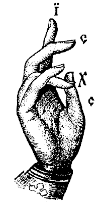
Rex Marsh Atomic Pistol. Patent drawing from the US Patent office. True views.

Just for fun, visit the Patent Room: The Art of Industrial Design to see a growing archive of actual patent drawings, "...a collection of early 20th Century industrial design discovered in the U.S. Patent Office archives." It includes drawings from the 1920s-1950s.

Chuck Close: A Systematic Approach to Portraiture


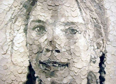
In this collage portrait of Phillip Glass, titled Phillip, by Chuck Close, one can see an overall structure of tonal values, whereby the artist successfully employs a full range in scale of white-to-black. Notice how values are placed according to similarity and proximity, and it is this carefully selected combination that makes it possible to render the portrait. Also, see how significant the grid system is in this piece, with incremental units evenly divided.

In order to create such a rendered composition, one must acutely observe the subtle shifts in light and shadow, form and volume. It is an organized, laborious, and systematic approach to constructing an image, and relies on the artist's ability to maintain extreme focus at every stage of the execution.

This can be seen in another Chuck Close example of a portrait, titled Georgia, which is constructed of handmade paper. Evident, as with so many incredible examples of his work, is his highly methodological, formal analysis of information.


"The remarkable career of artist Chuck Close extends beyond his completed works of art. More than just a painter, photographer, and printmaker, Close is a builder who, in his words, builds "painting experiences for the viewer." Highly renowned as a painter, Close is also a master printmaker, who has, over the course of more than 30 years, pushed the boundaries of traditional printmaking in remarkable ways.

Almost all of Close’s work is based on the use of a grid as an underlying basis for the representation of an image. This simple but surprisingly versatile structure provides the means for "a creative process that could be interrupted repeatedly without…damaging the final product, in which the segmented structure was never intended to be disguised." It is important to note that none of Close's images are created digitally or photo-mechanically. While it is tempting to read his gridded details as digital integers, all his work is made the old-fashioned way—by hand.

Close’s paintings are labor intensive and time consuming, and his prints are more so. While a painting can occupy Close for many months, it is not unusual for one print to take upward of two years to complete. Close has complete respect for, and trust in, the technical processes—and the collaboration with master printers—essential to the creation of his prints. The creative process is as important to Close as the finished product. "Process and collaboration" are two words that are essential to any conversation about Close’s prints." – via Chuck Close: Process and Collaboration

Links:
Chuck Close Exhibit at the Walker
Chuck Close Exhibit at the MOMA
Chuck Close Portfolio at Pace Prints
Self Portraits: Young Artists Create Oil Pastel Mosaics
Young Students Collaborate to Make a Portrait

Oskar Fischinger: Inspiring Motion Paintings


Featured here is the admirable modernist creator, Oskar Fischinger (1900-1967), an abstract painter and avant-garde filmmaker, whose non-objective “visual music” paintings, films and stills have inspired many artists, including painters, animators and filmmakers.

According to Peter Frank, "we now understand Oskar Fischinger not only as a link between the geometric painting of pre-war Europe and post-war California but as a grandfather of the digital arts."


He was a true master, coordinating symphonies of musical notes with syncopating forms, lines, colors, values, light motion and time. His work, both easel paintings and animations alike, was concerned with spatial dynamics, conveying complex perspectives, orbiting planetary bodies, buoyancy, weight, dance, and gravitational pull. Optical depth, rather than perceptual flatness, was achieved through penetrations, pulsations, saturations and resonance. The following quote briefly describes the one of his animated works, Allegretto:

“In the 1936 short Allegretto, diamond and oval shapes in primary colors perform a sensual, upbeat ballet to the music of composer Ralph Rainger. The geometric dance is set against a background of expanding circles that suggest radio waves.” – via NPR.

“Fischinger’s influence on the development of avant-garde abstract films is profound, with the genius of his vision acknowledged by 20th Century luminaries such as Orson Welles, Wassily Kandinsky, Moholy Nagy, Lyonel Feininger, Leopold Stokowski and John Cage. Fischinger's artistic innovations in film, recognized in Hollywood where he moved to work in 1936, eventually evolved exclusively into painting. In that medium he distilled his ideas in non-objective abstraction, presaging and significantly influencing Los Angeles‚ contemporary hard-edge abstract painters.” – from Arts Cenecal


“Concerned with more than mere formalist issues, Fischinger like Bauhaus master PauI Klee whom he greatly admired, sought to invoke in his abstractions Nature's operative laws. As a result, his forms in the spirit of Klee's, maintain an aura of vital forces - of growing, maturing and evolving in emulation of the powers that animate the cosmos to enter a Fischinger painting is to transcend the restraints of particular tirrie and to touch upon universals. It is this voyage he offers the viewer, launching thought visions on the winds of galactic visions into transcendent flight, that Fischinger's achievement resides.” – Susan Ehrlich Ph.D. 1988


Now, four decades after his death, one can see a select collection of his musical animations, in a recently released DVD titled, Oskar Fischinger: Ten Films, which can be found at the Center for Visual Music. Learn more about the artist at www.oskarfischinger.org.

A portfolio sampling of Oskar Fischinger’s exhibition may be viewed at the Jack Rutberg Fine Arts gallery web site.
Jack Rutberg Fine Arts
357 North La Brea Avenue, Los Angeles, California 90036-2517
Tel (323) 938-5222 Fax (323) 938-0577
E-mail,
Hours: Tuesday – Friday, 10am-6pm; Saturday, 10am-5pm

Hand-Drawn Lettering and Experimental Typography


This beautifully hand drawn alphabet is by Blake E. Marquis.

Graphic designers take note, there is an interesting traveling exhibition, titled Alphabet: An Exhibition of Hand-Drawn Lettering and Experimental Typography, which can be viewed now in Orlando, coinciding with the AIGA Conference.

“Focusing on an ordinary subject that we see each day, often in the hundreds of thousands, Alphabet presents 26 letters as more than just shapes for conveying information. The 48 artists and designers in this show conceive and interpret the alphabet in surprising and inventive ways, ranging from graceful and polished to witty and unconventional. The 60 alphabets featured in Alphabet were created by artists in North America, Europe, and Asia, and represent work from well-known typographers and designers as well as rising artists and design students.” – excerpt from the exhibition website.

ALPHABET GALLERY
Below are selected samples of some of the alphabets shown in the exhibition. Complete character sets (A-Z) of each alphabet in the show can be seen in the exhibition catalog or at one of the exhibition venues.

ANDREW BYROM / INTERIORS / 2003
A set of 26 table and chair frames built from steel tubing, Interiors forms a lowercase alphabet when viewed from certain angles. While some of the letters such as the h, m, and b look like basic chairs or tables, others like the e, t, and x become abstract, rather than functional, furniture.
Fabrication: Joel Wolter

LUKE RAMSEY AND A. PURDY / HYPER TYPE / 2005
Representing the pair's first collaboration, Hyper Type's obsessively detailed letterforms were created by Ramsey and Purdy in two marathon, ten-hour days.

APIRAT INFAHSAENG / SEVEN BOARD OF CUNNING / 2004
Constructed with Chinese Tangram puzzle tiles, Seven Board of Cunning takes the concept of Tangrams--that the tiles may be arranged into a variety of shapes--and applies it to typography, creating multiple versions of each letter.

MICHAEL STOUT (VISUALINGUAL) / IMAGEABILITY, PATHS / 2002
Pushing the limits of legibility, Imageability is a series of five fonts based on ideas from the book of the same title by Kevin Lynch. By reducing each letter to a minimal set of forms, Imageability explores the identifiers we use to navigate our landscape and language.

Exhibition info:
Website

Travel information
Alphabet will be traveling through 2008. Upcoming and past shows include:
October-November 2008 / Southern Illinois University / Edwardsville, IL
December 2007 / Ohio Northern University / Ada, OH
October 2007 / Cooper Union / New York, NY
July 2007 / AIGA Orlando / Orlando, FL
February-March 2007 / Minneapolis College of Art & Design / Minneapolis, MN
January 2007 / Pennsylvania College of Art & Design / Lancaster, PA
November 2006 / Northern Illinois University / DeKalb, IL
March 2006 / Workhorse Gallery / Los Angeles, CA
January-February 2006 / M-80 / Milwaukee, WI
November 2005 / Heaven Gallery / Chicago, IL
August 2005 / Lump Gallery / Raleigh, NC
July 2005 / Maryland Institute College of Art / Baltimore, MD

Select list of artists, designers and students, who are featured in the exhibit:
Andrew Byrom
Danielle Foushee
Arjen Noordeman
Paul Nudd
C.W. Roelle
Visualingual

One Point Perspective: Adoration of the Magi


Adoration of the Magi, by Leonardo da Vinci. "The preparatory drawing for the “Adoration of the Magi,” the painting commissioned to da Vinci for the main altar of the monastery of San Donato a Scopeto near Florence, reveals the Italian genius’s innovative approach to art. His originality and mastery of perspective are evident in the magnitude of the illusionary space that he created. He drew the ground first, then a plan for the buildings and finally animated the scene with human figures and animals. Using a millimetric ruler, appointed stylus and very fine threads, da Vinci created the perspective grid to transfer the drawing on a larger scale as a painting on a wooden panel." From Share the Perspective of Genius: Leonardo's Study for the Adoration of the Magi, an online exhibition hosted by The Library of Congress.

Leonardo da Vinci's work is really wonderful to look at when learning about drawing, not only how to draw in perspective, but also how to build form with line, to represent volume, to diagram, to explain thoughts, and so on.

With regard to perspective, as it is represented in Adoration of the Magi, see the following observations: Notice vanishing lines lead to a central point, called the central vanishing point. There is only one vanishing point in this drawing, and therefore we call it a one-point perspective drawing. The point at which the central vanishing point sits is called the eye level, or horizon line. For those viewers who are are not familiar with thinking of space depicted in perspective, note how objects that are closer to the viewer are larger, and objects that are more distant appear to be smaller. Imagine standing on a long stretch of flat road. One can see the painted lines of the road converging and eventually merging at a place where the road seems to disappear. It is that point which is called the "vanishing point."

The Museum of Science has an online exhibition, Leonardo da Vinci: Scientist, Inventor, Artist, featuring Leonardo da Vinci. Below is an exerpt from one section, titled Artist:

"Leonardo got his start as an artist around 1469, when his father apprenticed him to the fabled workshop of Verocchio. Verocchio's specialty was perspective, which artists had only recently begun to get the hang of, and Leonardo quickly mastered its challenges. In fact, Leonardo quickly surpassed Verocchio, and by the time he was in his early twenties he was downright famous.

Renaissance Italy was centuries away from our culture of photographs and cinema, but Leonardo nevertheless sought a universal language in painting. With perspective and other realistic elements, Leonardo tried to create faithful renditions of life. In a culture previously dominated by highly figurative and downright strange religious paintings, Leonardo's desire to paint things realistically was bold and fresh. This call to objectivity became the standard for painters who followed in the 16th century.

No slouch when it came to the techniques of the day, Leonardo went beyond his teaching by making a scientific study of light and shadow in nature. It dawned on him that objects were not comprised of outlines, but were actually three-dimensional bodies defined by light and shadow. Known as chiaroscuro, this technique gave his paintings the soft, lifelike quality that made older paintings look cartoony and flat. He also saw that an object's detail and color changed as it receded in the distance. This technique, called sfumato, was originally developed by Flemish and Venetian painters, but of course Super-Genius Leonardo transformed it into a powerful tool for creating atmosphere and depth.

Ever the perfectionist, Leonardo turned to science in the quest to improve his artwork. His study of nature and anatomy emerged in his stunningly realistic paintings, and his dissections of the human body paved the way for remarkably accurate figures. He was the first artist to study the physical proportions of men, women and children and to use these studies to determine the "ideal" human figure. Unlike many of his contemporaries -- Michelangelo for example -- he didn't get carried away and paint ludicrously muscular bodies, which he referred to as "bags of nuts."

All in all, Leonardo believed that the artist must know not just the rules of perspective, but all the laws of nature. The eye, he believed, was the perfect instrument for learning these laws, and the artist the perfect person to illustrate them."

Woven Beauty Forms: Paper Weaving


This is a photo (by Kiyoshi Togashi) of a simple paper weaving technique, known as the 14th Gift, Woven Beauty Forms, developed by Friedrick Froebel, and pictured in Inventing Kindergarten, a book by Norman Brosterman.

Friedrich Froebel [1782-1852] is best known as the inventor of the kindergarten system, an educational method used a while ago to teach children between 3-7 years old. “Inventing Kindergarten is the first comprehensive book about the origin of kindergarten, a revolutionary educational program for children that was created in the 1930s by charismatic German educator Friedrich Froebel. Froebel’s kindergarten was the most successful system for teaching children about art, design, mathematics, and natural history ever devised. Kindergarten changed the world, and this book tells the story.” – Diane Ravitch, author of The Troubled Crusade: American Education 1945-1980, and former secretary, U.S. Department of Education. See, Inventing Kindergarten, by Norman Brosterman.

In the 1840s, Froebel designed a number of geometric toys, he called "gifts," as a part of his educational system, some of which include sets of blocks, stick work, rings, net drawing exercises, paper weaving, slat work, joined slats, paper interlacing, and peas work.

Upon close inspection, and with some investigation, it can be argued that Froebel’s work was incredibly influential and important to the worlds of art and architecture. As examples, upon becoming familiar with Froebel’s Gifts, see the works of any of the following artists and architects, then decide for yourself if there is a connection:
Wassily Kandinsky
Paul Klee
Frank Lloyd Wright
Piet Mondrian
Georges Braque
Le Corbusier
Josef Albers
Buckminster Fuller

See more patterns. Look at William Morris, famous designer in history. See a contemporary example of woven beauty forms in Peggy Dembicer’s work featured on Flicker and in a recent article in Make Magazine.

Froebel’s Gifts can be purchased today from a variety of sources,
http://www.froebelusa.com
Froebel USA being just one.


Check out the book, Inventing Kindergarten, by Norman Brosterman. Photograph by Kiyoshi Togashi.

The Invention of Drawing: An Artist Reveals Perspective


The Getty Museum has this wonderful drawing, The Invention of Drawing, which documents one method of drawing. Illustrated here is an artist tracing the shadow of her model. Notice how the drawing is a precise rendering, done in two-point perspective. A single flame provides the light source for all of the shadows. The drawing contains a full range of values, from lightest lights to darkest darks. The horizon line, or eye level, is low, almost, if not exactly where the pencil touches the wall. Perspective lines are dramatically featured in the wall-mounted shelf, the lines of the furniture, and the stone wall grid.

Perspective drawing is a method of representing the appearance of objects, places, architecture and even people. Parallel lines are represented as converging, which gives the illustion of distance. There are many valuable sources to which one can refer in order to understand perspective. The following link is one good example that covers the basics of linear perspective.

Image information:
The Invention of Drawing (recto); Sketch of Lower Leg Bones of Human Skeleton (verso)
Joseph-Benoît Suvée
Belgian, about 1791
Black and white chalk on brown paper (recto); graphite (verso)_21 1/2 x 14 in.
87.GB.145

Ray and Charles Eames: An Illustrated Design Process


Currently teaching two classes, Sketching and Rendering for Industrial Design, and Basic Design, at Rhode Island School of Design, Drawing Connections readers will notice some entries are geared towards students. This is one such entry.

When developing drawing and design skills, it can be tremendously helpful to nearly simultaneously practice drawing and observe drawing practice. Practice. Practice. Find designers who use drawing as a part of their design process. Study the drawings.

The objectives of this exercise include:
1. comparing multiple examples of drawing styles and techniques;
2. understanding the act of drawing is an individual expression, and that each person will have their own drawing voice or style, unique from other people;
3. discovering appropriate drawing materials and substrates for design drawings;
4. considering how drawing can play a significant role in the design process;
5. exploring the use of line, from informal and rapid sketch, to the detailed finished rendering; and
6. seeing how designers employ the visual language of drawing to generate ideas for designs, think through a design problem, communicate plans to other audiences, and document important details in the process.

It does not take long to find a variety of examples, illustrating a considerable, respectable range of drawing approaches, styles and techniques.

For the purposes of participating in the exercise, this article features the work of the married design team, Ray (1912–1988) and Charles (1907–1978) Eames, American designers, who accomplished many works of industrial design, furniture design, art, graphic design, film, and architecture. Below is a photo of Ray and Charles Eames working on an exhibition model.


Below are some additional samples of their drawings. See a doodle-type drawing, by Charles Eames, which is themed about life around the house; collage drawing of an Eames chair, complete with a suite of accessories; and an exploded view of the Eames lounge chair. The bubble diagram, featured at the beginning of this article, illustrates the Ray and Charles Eames design process. If you are interested in learning more about the Eames’ work, explore the following links:
The Eames Office
The Eames Foundation
The Design Museum
“Exhibit: The Work of Ray and Charles Eames: A Legacy of Invention”
The Eames Gallery
Herman Miller


Poetry Comics: Every Line in a Drawing Counts


US readers: I hope you are having a good holiday! To help celebrate, here is a delightful comic, illustrating a well-known poem, from Poetry Comics, by William Carlos Williams.

This cartoonist’s style is direct, clear and not overly pretentious in the way in which it was drawn. Dave Morice, the artist, reframes the poem, imbuing it with more meaning. Before I saw this comic, I never thought of this poem as being funny. The line quality and content has everything to do with the viewer's perception. In a drawing, just as in a poem, every line or mark is important to the overall message.

"Every word in a poem counts. A word conjures an image, images juxtaposed to create something new or suggest something elusive. Comics, like poetry, are about simplifying and paring down. There is only so much space on a page and every mark must count. Visual concerns are crucial for both mediums. A cartoonist cascades panels across a page as a poet decides the placement of each line and letter." – from the National Association of Comics Art Educators

"Like poetry, sequential art has been around throughout history, with familiar examples found on cave wallsand Mayan temples. "A sequence of illustrations causes a reader to make links between the information portrayed in each. For instance, a picture of a man pointing a gun at another man followed by another picture of the second man falling to the floor creates the assumption in the reader that the gun was fired. We don't see the gun being fired, but we know that it happened. This effect is called 'closure' and is one of the main tricks of human perception that gives comics their power. Through closure, even seemingly unrelated pictures can be linked to create a sequence of events, or elements of a theme." – from an article, titled Comic Strips or Sequential Art, posted by the BBC

Also see:
Roz Chast
The Eric Carle Museum of Picture Book Art
Poetry Comics: A Literary Postcard Book, by Dave Morice
Collected Curios
Sequential Art Gallery
Quotes About Writing

Rendering for Industrial Design: A Look at Raymond Lowey


About This Drawing:
Raymond Lowey created this Skylab rendering on a dark indigo blue background. Line work is done mostly in white pencil and highlights are white gouache paint. The background color is very much a part of the object. See how much of the paper actually shows through the object. Refined details, like parting lines, fasteners, surface texture, and a strong indication of light direction give the viewer plenty of significant information. Notice how the drawing is done in three-point perspective, close to the horizon line, with the vanishing points far off to each side. This effect gives the object a convincing, life-like appearance, as it is one of the most familiar ways one encounters or sees the world around them.

Drawing Tips:
1. Allow the background color to be an active part of the drawing. Avoid overworking the surface. Keep the drawing fresh and unlabored, providing only important information.
2. Include a variety of details that help the viewer understand the object, including clues regarding material, function, texture, weight, scale, volume, and context. Whenever it makes sense to do so, include an indication of human scale, as it will lend volumes of information to the piece.
3. For a convincing portrayal of drawn objects, be aware the principles of perspective. Place objects in the center of the cone of vision and close to the horizon line.
4. Including light and shadow in the drawing will help the viewer understand the figure ground relationship, time of day, light source, and three-dimensional volume.
If you would like to work on this technique, use a Canson toned paper (or similar), Prismacolor colored pencils (or similar), pastel powder mixed with baby powder and gouache.

Lowey Drawings:


About Lowey:
“The Shell logo. The Greyhound bus. The S-1 locomotive. The Lucky Strike package. The Coldspot refrigerator. The Studebaker Avanti. These and many other modern design icons were all created by Raymond Lowey, "the father of industrial design." Arguably one of the most influential designers of the 20th century, Loewy has been called the "man who shaped America." He left his mark countless times on everyday culture from household products, to transportation to corporate identity. Loewy was one of the first designers to understand the link between design and the economy. He expressed this connection by stating: "Between two products equal in price, function, and quality, the better looking will outsell the other."
Raymond Loewy (1893-1986), a brilliant designer and, without doubt, the most versatile ambassador of this discipline, became a design legend in his own lifetime. He was the most influential protagonist of industrial design that North America has ever known and has had a significant impact on the tastes and lifestyles of several generations. Loewy’s design philosophy still has an influence on the industrial design world today.” – This brief excerpt is from Art Net. See http://www.art.net/Lile/loewy/loewy.html

Design for Good

Creative powers focused on helping people. Good news.

According to Worldbike.org: "Worldbike is an international network of bicycle designers and industry leaders, and international development professionals, working together to provide transportation solutions and create income-generating opportunities for the world’s poor. All across the developing world, people use bicycles the way we use pickup trucks and school busses. However, the bicycles sold in developing countries are those designed for recreation and are ill-suited to carrying loads.

Worldbike designs higher-strength, longer-wheelbase bicycles with integrated cargo capacity. We conduct test markets to determine the ideal price levels, work with the bike industry to get the best quality parts and frames at the lowest cost, and partner with international development organizations like Kickstart International to sell and distribute the bicycles.

In May of 2007, Worldbike was selected by The Cooper Hewitt National Design Museum to have two load-carrying bicycles in their “ Design for the Other 90% ” exhibit. The two bicycles selected are the Big Boda and the Worldbike."

Check out Worldbike .
Customize your bike with Xtracycle .

Observing Consumer Consumption


Artist and photographer, Mark Luthringer, uses photographs to index categories of the things he sees. The comparisons of similar objects and places are striking and thought-provoking. While one can see an amazing display of possibility, consumer choice and innovation through design, branding and manufacturing technology, alternatively one can see an overall sameness to the content, presentation, architecture and environment.

There is hope and despair in his work. Hope in that design and technology can provide solutions en-mass, and despair in the realization that, given the creative potential for a vast variety of design solutions, what this artist so adeptly points out, our objects of desire, such as homes, furniture, vacation destinations, meals, and clothes are generally the same and by comparison very uninteresting.

Luthringer’s compelling work clearly places him in the unique category of acute observer, curator and anthropologist. Architects and designers, both graphic and industrial, will be interested to view his work. Below is a portion of his Artist Statement, which along with his work can be found at his website, markluthringer.com .

"The typological array’s inherent ability to depict prevalence and repetition make it the perfect technique for examining the excess, redundancy, and meaningless freedom of our current age of consumption. Part of my intent with this work is to answer the question implied by the title of Robert Adams’s book What We Bought: If there is some kind of big sellout occuring, what are we getting in the deal?"

Drawing Research


The Drawing Research Network is a loose affiliation of individuals and institutions who are involved in some way with drawing research, for example via professional practice, education or the promotion of drawing. Some participants are based in universities and colleges of art and design with established teaching and/or research profiles in drawing. Other participants have an interest in, for example, drawing therapy, the cross-curricular role of drawing in schools or digital drawing. Some participants simply have an interest in drawings and the drawing process which might include in making, thinking about and communicating on drawing. Individuals and institutions use the Network to communicate news, to explore possibilities for cooperation in drawing research, to formulate collaborative projects and to share outputs. Membership of the Network is free. Drawing Research Network or, http://www.drawing.org.uk/
Note: If this link does not work, try pasting the URL into the address bar or do a Google search based on "drawing research."

Exhibit: Doodles, Drafts and Designs


Interested in an historical perspective of industrial design drawings and creativity from America? The Smithsonian offers the online exhibit, Doodles, Drafts and Designs: Industrial Drawings. Below are three brief excerpts from the site:

The Creative Process of Drawing for Industrial Design
“Engineers, inventors, and designers produce drawings as part of their creative process. They draw to work out and refine concepts and details. They draw to persuade. They draw to give direction. And they draw to record their ideas and to learn from others.”

Conceptualization
“Drawing is a key element in the process of working out ideas. Drawing moves an idea from the "mind's eye" to paper, the first step along the path from thought to three-dimensional reality. Inventors sketch as they think, developing their ideas on paper more quickly and more easily than they might in model form.”

Presentation
“Industrial drawings convince. By allowing viewers to imagine a building or machine before it is built, drawings make the idea seem real and viable. Gone are the tentative lines of conceptual drawings. With their straight lines, careful shading, and right angles, these images make the technology appear almost inevitable.”

Learn more about the design process, including the important detailing and recording steps. Experience the exhibit and see examples of the industrial design process, illustrated in drawings. Doodles, Drafts and Designs: Industrial Drawings from the Smithsonian is a traveling exhibition developed by the Smithsonian’s National Museum of American History, Behring Center, from the collections of the National Museum of American History and the Smithsonian Institution Libraries. Organized for travel by the Smithsonian Institution Traveling Exhibition Service.

Paperless Drawing and Animation


An animator describes how he utilizes the Wacom Cintiq to do animation, effectively eliminating the need for thousands of paper drawings, during the production process.